
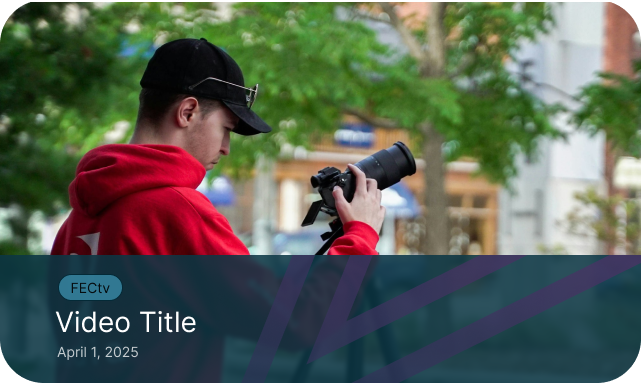
Creating an updated website for a local community media company


Overview
I was hired to design and implement the new site for Access Framingham, a community media company based in Framingham, Massachussets. They wanted to switch from their old software to Webflow because they planned to use a backend service built to manage media content for Webflow sites. I created design systems and tested prototypes using figma before implementing key components, resulting in an over 50% increase in conversions and a large boost in video content engagement.
Role
Product Designer
Webflow Implementer
Duration
4 months
Team
Jason Daniels - Project Manager
Emily Frazier - Implementation
The Challenge: An update that feels smooth but genuine
Access Framingham's website is crucial for its operation as a community center; It's where people of all age ranges can keep up with the organization's programming, membership updates, and much more. The team at Access Framingham felt that their old site did not do that live up to that level of importance as well as it could. They wanted a new site that would stick in people's minds, making their brand more recognizable, and feel satisfying to use and explore. The client also expressed frustration at the difficulty of use of their previous web building software.
Competitive Research: What works already?
In order to get a good grasp of what a successful site looks like, I gathered references from 15 different community center sites and took notes on what went well, and what went wrong. I then presented what I learned to the team to better identify the pain points getting in the way of the user experience on the old site.
Community centers tend to have a lot of information and services to offer. The desire to show all of these things at once is understandable, but ultimately often leads to the audience understanding nothing rather than seeing everything. Successful sites tended to be broad at first, letting the user funnel deeper into their own specific interest basedd on the options presented.
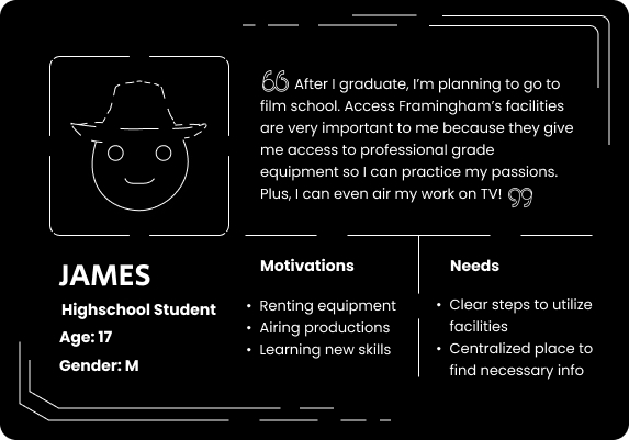
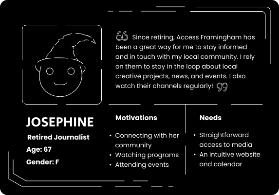
Identifying the Users
So, we know we're looking for direction in a simple and consistent way, but what should that direction be pointing towards? To answer this question, I studied research the organization had already done, and did a series of my own talks with the team and members of the community to figure out what their motivation was for being involved with Access Framingham.
The Design Goal: Flowing through a Branching River
To successfully guide our users into their desired actions, we can think of the site as a river that continues to branch off as it flows downstream. Initially, the river only branches into two paths: one for the "creators" and one for the "consumers." From there, the branching can be more specific, and more complex. This style improves user conversion by reducing the pan point of overwhelm, since it is a lot easier to pick an option out of a few choices than picking one out of 20.
Consulting Previous Designs
Prior to this initiative, Access Framingham had invested in some design work to update their brand identity moving forward. The main materials I consulted were 2 ~20 page infographic reports and an asset folder of logos, icons, and the like. Below is an example of an updated logo.
Prototypes: Wireframing an Example Page
I started with some sketches based on the research I had done of the various types of layouts we could use for a community center website along with the branding from the organization's documents.
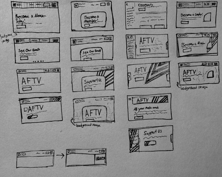
From my sketches, I decided the following 3 designs were the most adaptable and suited towards our goals, so I created corresponding lo-fi wireframes.
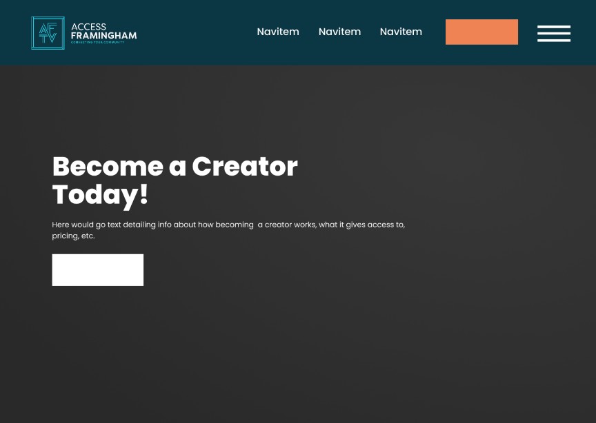
I presented the options to the client, and we discussed the drafts to decide what would be best to move forwards with. The first option would use an image or video as a background, and, although we liked the design, me and the team decided that we wanted to build a page that would allow me to exercise the most usage of my design skills. Thus, we went with option 3, where I could add significantly more personal design touches to the page through the components and empty space.
Problem: "What if we can't use gradients?"
The team expressed concerns at the use of gradients, worrying that designs might not show up properly for people on older, incompatible, browsers, especially since older demographics are important to the company.
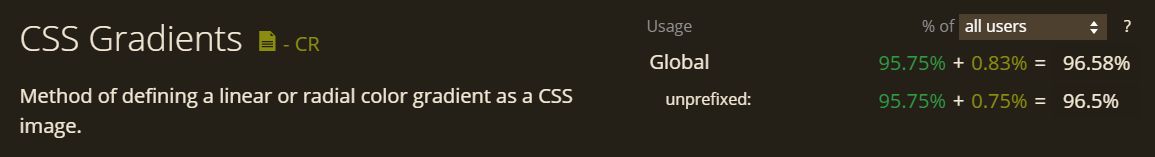
Using data from caniuse.com and other sources, I was able to reassure them that CSS gradients were widely supported on the vast majority of modern users' systems. However, I still didn't want to dismiss this concern, and saw it as an opportunity to experiment with other aspects of the company's identity in my navbar design. Thus, I built various gradient-less navbars where I leaned into the angular-ness of the company's previous designs.
Gradient-less NavBars
Option 1
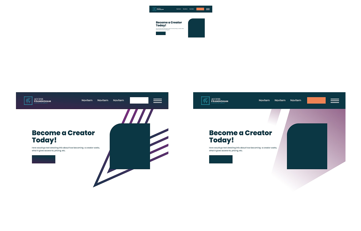
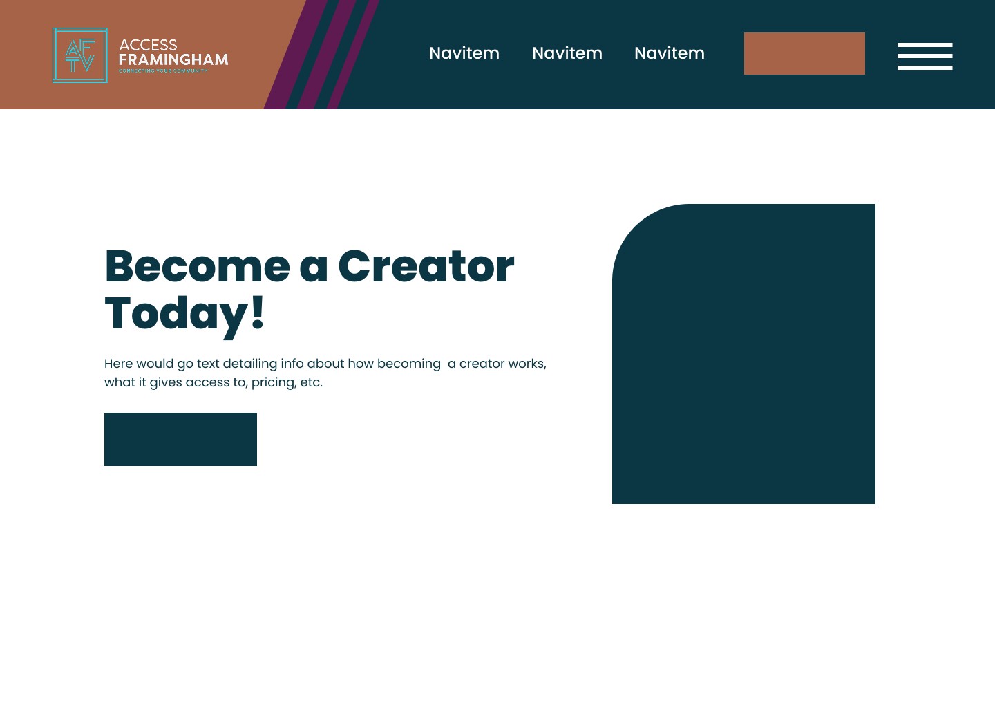
I pushed myself out of my comfort zone by leaning into color combos I usually wouldn't. To maintain the feeling of "fading" without using a gradient, I used lines of gradually decreasing widths.
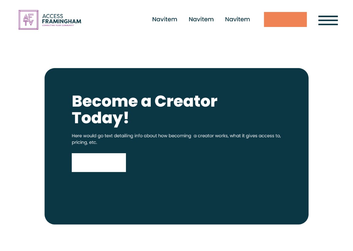
Option 2
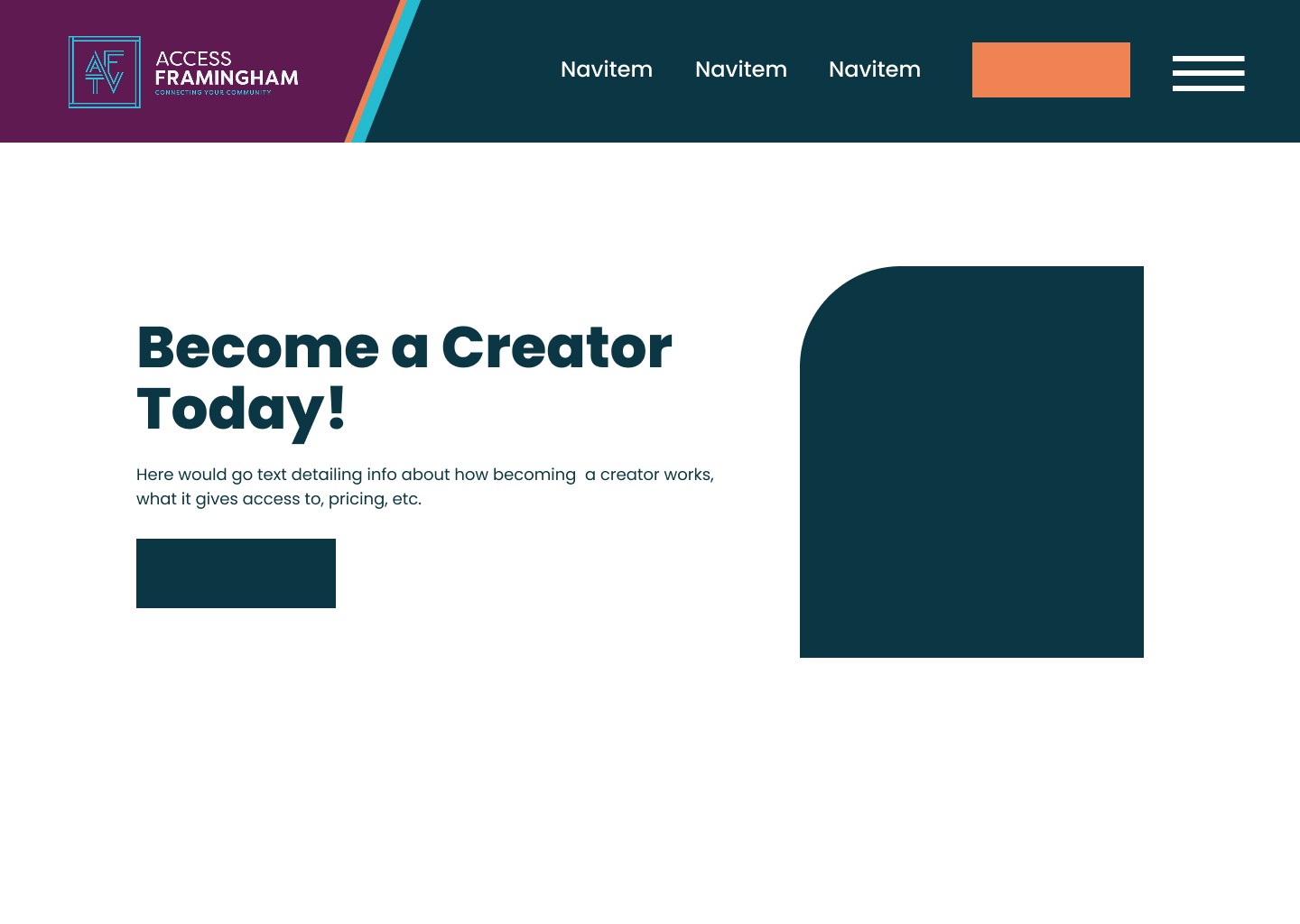
Here, I leaned into a more simplistic flat color approach. The small line of orange on the left side adds some subtle emphasis that brings a nice rhythm between the logo and the support button.
Honorable Mention
The stakeholders decided that they preferred option 2 for its satisfying color usage. I iterated upon it further by tying the previously used gradients back in, with the assurance that they would be compatible with the userbase and that there was a backup to fall back on in case of failure.
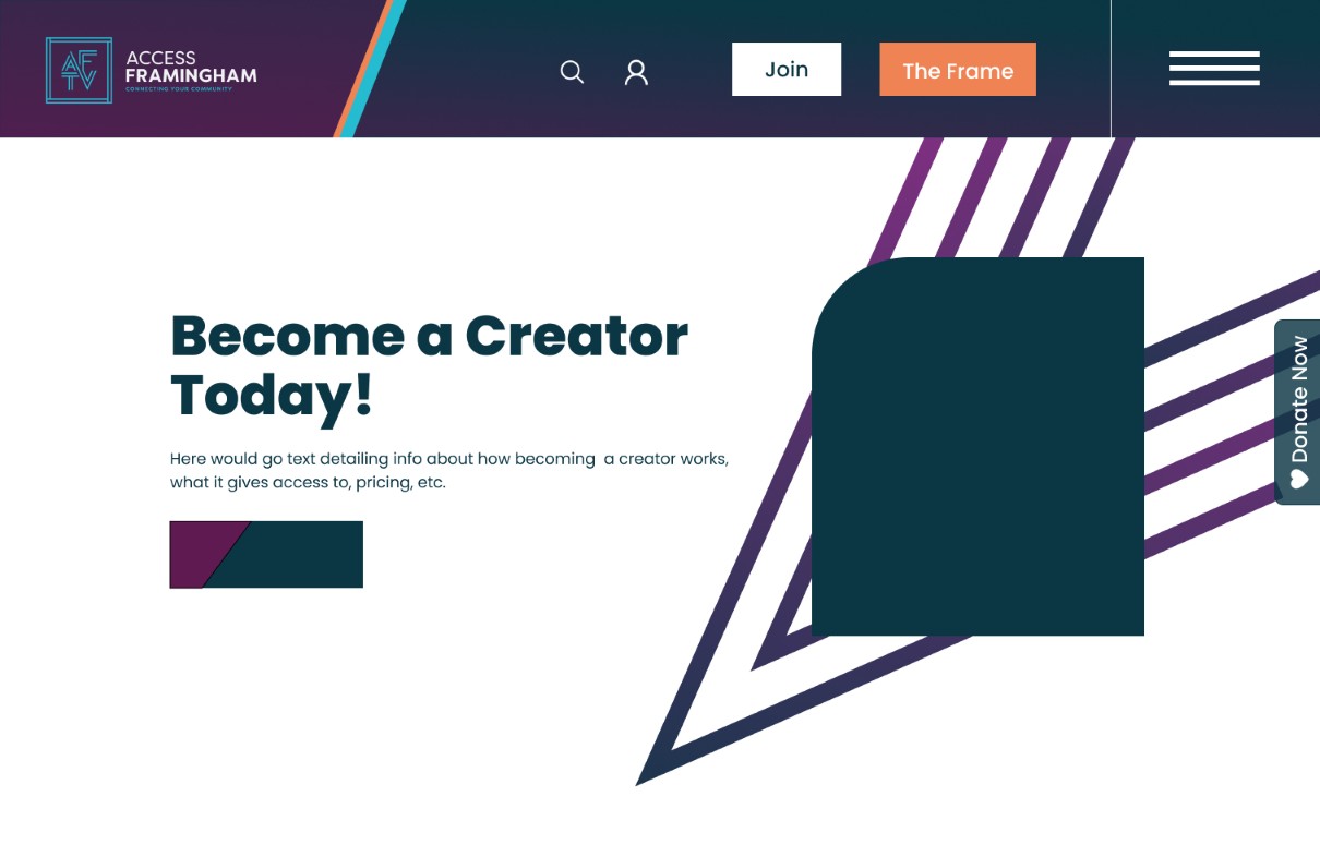
The below design was a successful option that balanced flat colors with the use of gradients, combining a satisfying sleekness with the brand's iconic angular style.
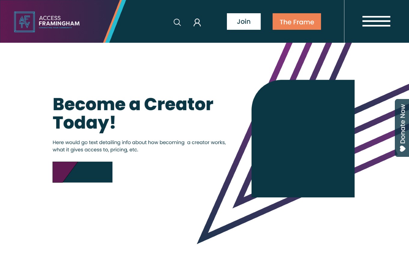
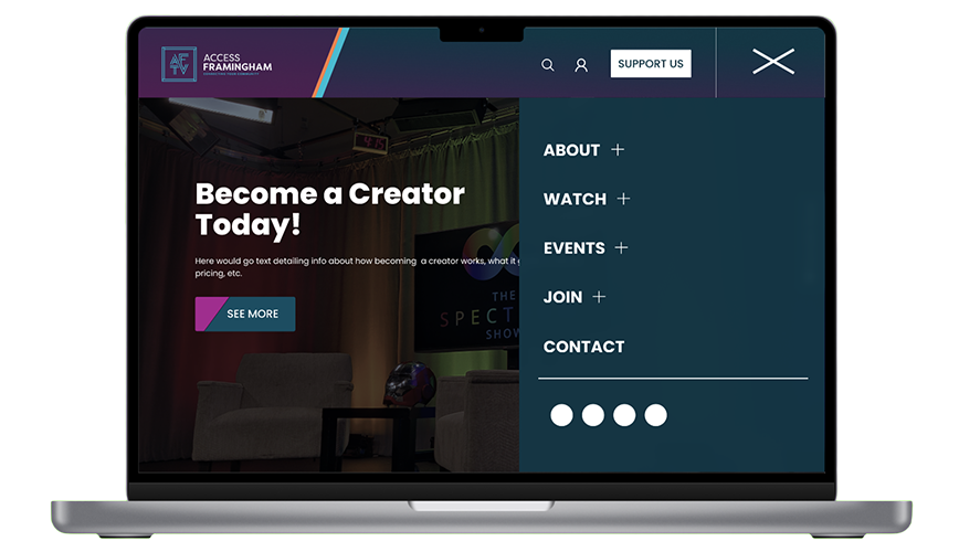
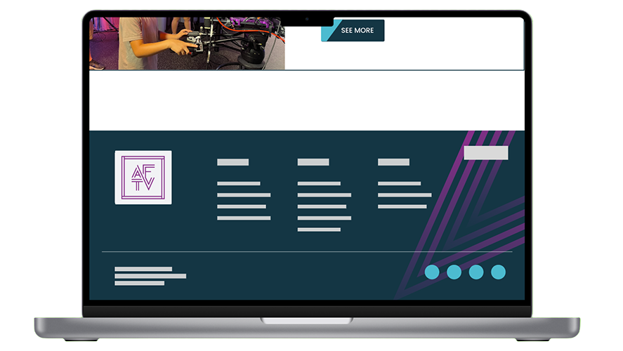
The Resulting Page
The gradients and color palette added a freshness that was exciting for the organization as they moved into their next chapter, but it still maintained the identity of what made up their brand's design previously. The orange and white buttons stand out here due to their contrast, ensuring an increase in conversion rates.
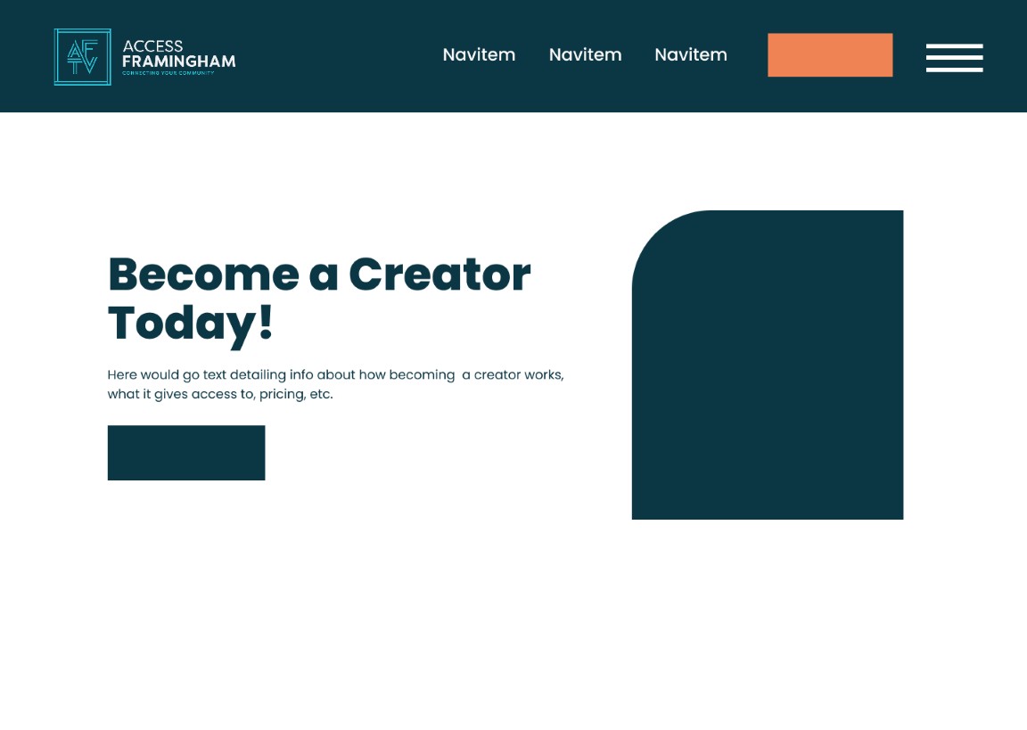
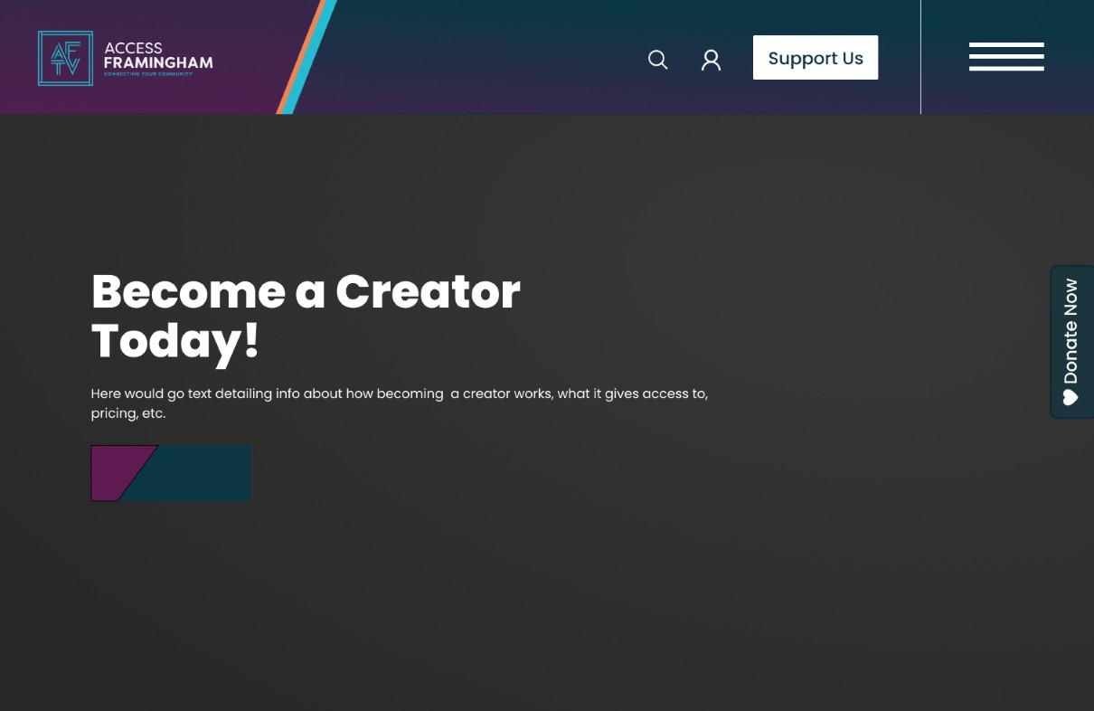
After making this page, I also created a version of the original image landing page using a similar design to show the implementation of this style across different layouts.
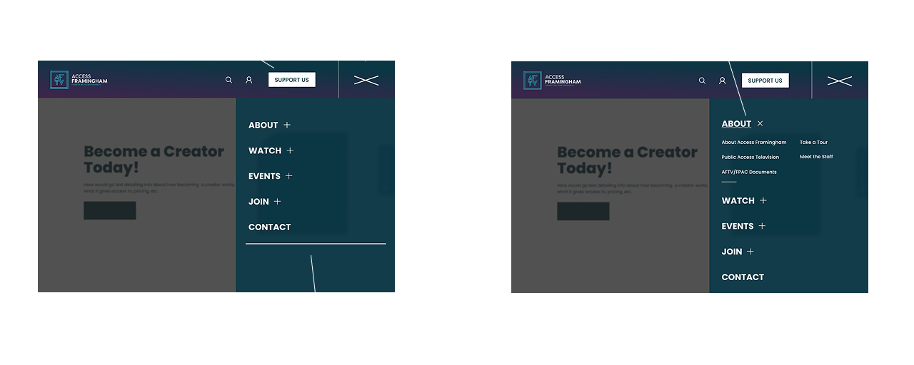
Designing the Nav Menu: Solving Overwhelm
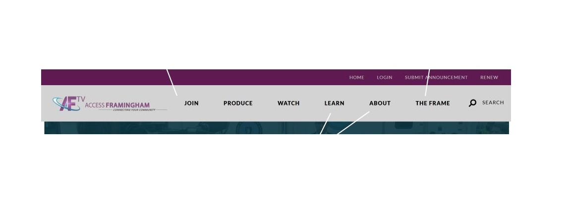
Based on the research Access Framingham had already done and my own conversations with my team and users, a large problem for the original nav menu was that there were so many options to choose betwewen. It feels like a requirement to fill the navbars to the brim with options, but navbars with lots of content can feel overwhelming, causing decision paralysis in the user. The navbar for the old AF site suffered from this issue as well.
So how can we address this pain point?
Well, a good starting point is to have a clearly defined structure for what we want. Together, me and the team gathered all of the different pages that were needed and worked to categorize them in a format that was intuitive to users. We prioritized concise but clear titles that felt significantly unique from each other. Though overlooked, this is one of the most important steps, as a confusing navigation structure is disorienting and will result in frustrated users and lower conversion rates.
Above is the structure we landed on, which gave me a solid framework for my design in the next steps along with the confidence that our navigation logic was accessible to users.
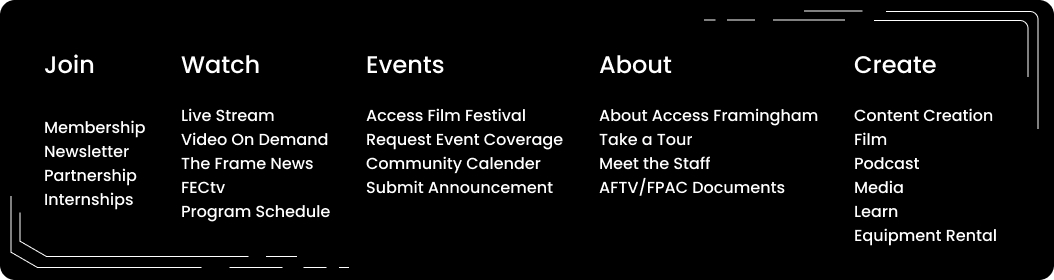
The solution: Expandable nav menu
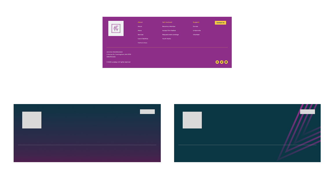
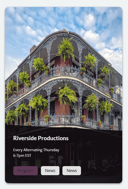
Additional Components
In addition to the nav menu and page layout templates, I designed various components. I used the fonts, spacing, color palettes, and shape language we had decided on previously to establish a design consistency across the site.
Results: The Completed prototype
Finally, I combined everything I had created into an animated prototype demonstrating the core functionalities of the site. Click the button below to try it yourself!

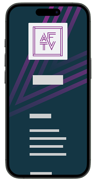
Designing for Mobile
The last step of the design phase was ensuring my layouts were responsive. I used Figma's auto-layout to ensure clean mobile scaling and consistent spacing.


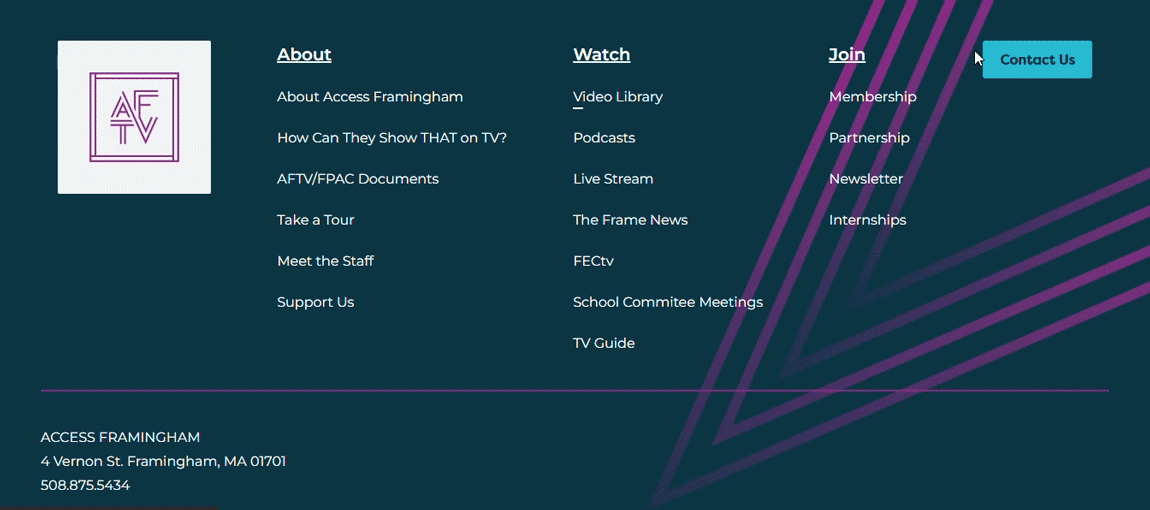
Webflow Implementation
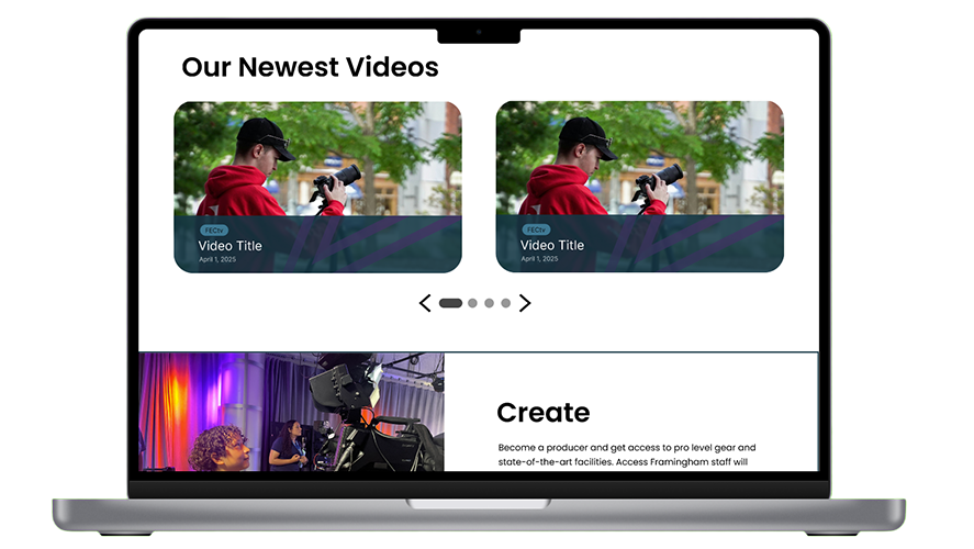
Of course, the ultimate goals of these designs were to have successful, usable implementations. I designed my mockups using features such as auto-layout to make sure the handoff was smooth for the implementation team. In addition, I added most of these components to the Webflow site myself using my knowledge of CSS and JavaScript. The below components are some examples of fully animated, functional, and responsive implementations. On the site, they follow clear naming conventions and are architecturally optimized for fast speeds.

Next Steps: Metrics
The following are the metrics that will continue to be analyzed to determine the success of this initiative:
An increase in user conversion at the various action items on the site, especially supporters.
An increase in traffic on the multitude of video content accessible through the website.
Higher general user satisfaction as tested through interviews and surveys.
Interest from the larger community of community centers, many of whom are also looking into similar rebrands.
So far we have seen clear improvements in each of these categories. Access Framingham has recently won numerous awards for their work as a community center, and this new updated website has only added to their momentum and the praise they have received. I am honored to have been a part of their journey in strengthening their community!
Takeaways: So what did I learn?
Limitations are chances to push yourself!
When I was asked if gradients would be okay to use for the userbase, I could have just done research to prove that it was and moved on; however, I decided to instead make extra versions in case the team decided against using gradients. Those extra versions ended up inspiring me in ways that made i back to the main design even with the gradients, all because I decided to put a limit on myself so I could explore something new. Throughout this project, this came up again and again: limitations are an opportunity to push yourself out of your comfort zone and find a new way to make something work.
Your team is there to talk things through
For a site like this, every decision counts even down to the order of the options in the navigation menu. Over the course of this project, a lot of my time was spent talking through ideas with the client. It's easy to assume everyone is on the same page, but the best work is built on true understanding, not assumptions. Taking the initiative in voicing any concerns, checking in on the client's satisfaction, and double checking important details makes all the difference. It's how you ensure that you're working with the cline, and not just for them.