
A mobile app connecting book lovers with new books using a Tinder-style swiping UI.


Overview
Paper Matche is an app that presents a feed of books based on user preferences. Users can swipe right to add the book to their collection where they can track their page progress, buy the book online, read reviews, and see discussion posts about the book. I started this project with a small team consisting of a product strategist and some help from a programmer. My work consisted of user research, design through Figma, and prototype implementation through Swift for iOS.
Role
Product Designer
Swift Programmer
Duration
5 months
Tools
Figma
Procreate
Swift
Firebase
Competitive Analysis: How are our features different?
The core idea of this app was its easy-to-use UI that simplifies the process of finding new books. Therefore, seeing what the standards were in the space, and what new ones we could introduce, was crucial.

I found that other competitors did offer book recommendations; however, it was usually as a secondary or tertiary feature to their main purpose. Paper Matché address the pain point of intimidation for readers, meaning that the app will ease the intimidation readers feel by the abundance of book options they face on other sites by focusing on one book at a time.
So, I've figured out the defining features I want to implement, but how can I make sure they're implemented in an effective way. Figuring out my target audience will allow for analysis that reveals what style of implementation will be most effective.

The User Persona tells us that the app benefits most when it engages with the user's passion. Readers like Elaine long to be connected with the world of books without being overwhelmed. On other platforms, it can be easy to struggle with information overload, so this app can capitalize on its format by only showing necessary information and allowing the user to look further for the rest if they are interested.
Strong theming can also make the app feel like a unique platform targeted specifically towards their hobby. If the app resembles apps for other platforms that they use for tasks such as school readings or planning, they might feel burdened instead of excited.
The Design Goal
Create an intuitive, easily understandable app prototype that resonates well thematically with the visual motifs and iconography of books. By being able to look through a feed of books one at a time, users can feel less pressure to decide amongst a huge list of options.
Establishing a brand identity was a great place to figure out the direction of the rest of the design. "Books" was too wide of a starting topic, so I broke the project down into 3 main iconographic ideas:
- The book, represented through a physical book or a bookmark
- The heart or check mark, representing the idea of “liking” a book.
- Paper Mache, tying into the play on words in the name and being represented through textures or shapes.


I focused on 3 different paths for my initial sketches: The motion of the swipe, the multiplicity of the books, and the heart. After looking at these initial sketches, I felt that the heart with the bookmark was the most adaptable and useful idea, and decided to iterate on that version.

After a few more iterations, I had the idea to instead use straight, rigid lines, creating the feeling of folded paper. This design was inobtrusive, adaptable, and sleek while still feeling in place with the theming of the app.
The Resulting Logo
Thanks to the linework I had of my new design, I was able to create multiple different versions of the logo for use throughout the app. Now that I had a logo, I was ready to start figuring out some functionality.

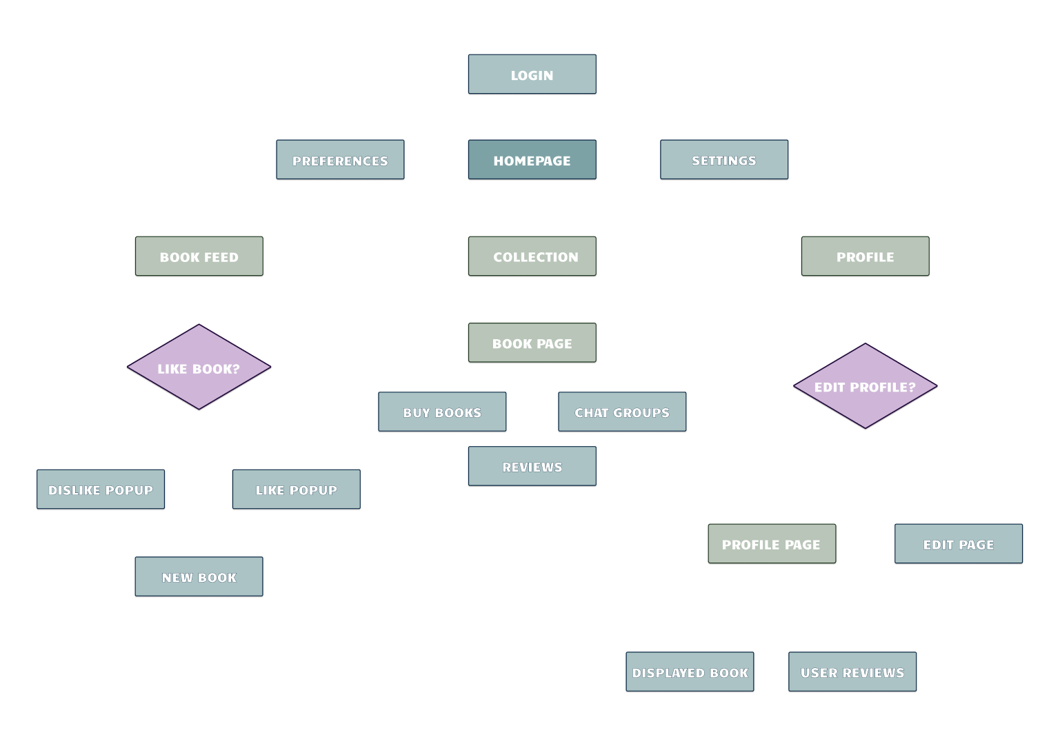
Next, I designed the hierarchy so I could map out the order in which features should be implemented and presented. With a clear map of the function I was striving to achieve, I was able to start thinking about how my design could help shape that.

In my styling, I knew it was important to maintain strong ties to literature in the design. The Freeman and Garamond fonts were selected due to their strong ties to poetry and novels respectively. Serifs in the body text felt like an important decision that would make the app feel more book-like. The same decision influenced the light brown "page-colored" background.
Now, it was time to sketch things out to get a feel for the layout. I needed to keep it simple in the app, with the books being the primary focus. To lean into the theming more, I imagined the headings as chapter titles, and the paragraphs as mini chapters. I referenced book design to bring this vision to fruition through my layouts.

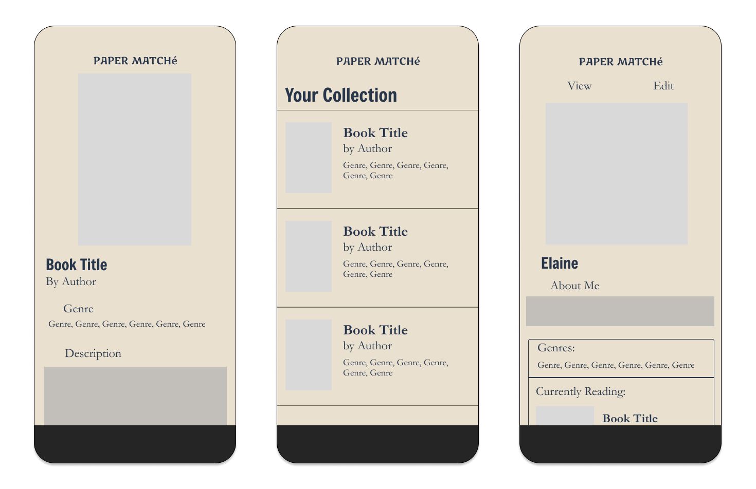
For my first drafts, I began with the 3 main starting pages from the user flow: the book feed, the user's collection, and the user's profile.


Time to start developing even more! The book feed is the core of the app, so it would be my first target. I added a book and some information to the page. I used loose text and minimal lines or shapes to resemble a book's layout. I then animated the like and dislike functionalities. The user can swipe right to like and left to dislike, resulting in a quick sequence before the next book shows up.
Finally, I added icons to the navbar for the core pages along with the hamburger and search icons in the top corners of the screen. These 3 icons make it clear to the user what the primary usage loop of the app is.


Next, I fleshed out the book collection page. In here, the user's liked books are displayed with the user being able to scroll though and click on books in their collection. The books are then displayed with their image, their title, their author, a page progress tracker, and buttons to buy the book or see chat groups, discussion posts, or reviews.
Users can also access their profile through the navbar, where they can add a profile pic, About section, and some of the books they're currently reading. After these pages were added, I was ready to move on to some user tests.
Problem" "Which way do I swipe to like?"
From my tests, the most glaring issue was a quite straightforward one: users couldn't tell which direction to swipe on the book feed to like a book vs. dislike it. In addition to that issue, there were a couple others:
- Users felt that it was also important to be able to see the reviews of a book that was displayed on the feed.
- Users appreciated the simplicity, but felt the app might start to look repetitive without more varied components.
To address the swiping issue, I added an animation to show the like and dislike icons on the corresponding side of the page. This would play when the user first opens the book feed. It was very successful, resulting in only one person being unsure of which way to swipe compared to over half previously.

Furthering these improvements, I improved the visual contrast by creating a button component for genres. These buttons made it clear that the user would be able to click on them to see more books of that genre while also creating more varied visuals. The genres could also now be put in horizontal scroll frames meaning books with many genres can still fit into the template. Headers were given an underline to add more stability to the pages.


The last major pages I added were the chat group pages, where the user can talk to other readers about books they're reading. The user can access this page through books in their collection. The features me and the product strategist felt to be most important here were seeing how many active groups a book had and a simple system for joining chats. I also came up with the idea for an Auto Pair feature, which would match users to a group based on their preferences. I referenced existing messaging apps for the design so it would feel intuitive to pick up.
The chat rooms increase user engagement and retention on the app by allowing them to build community with others interested in the same books as them.

And as a fun little final touch, I created a startup animation to seamlessly flow into the login screen!
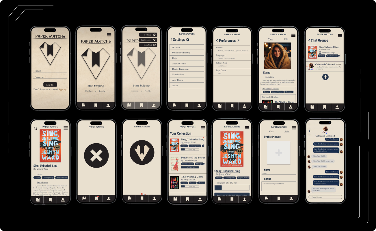
The image above shows most of the finished pages that I created in this project. In addition to what has been shown already, you can also see the start page, the settings and preferences pages, and the edit profile page. If you're interested in seeing the full scrollable pages, please click the button below to check out the prototype!
I created an initial, functionality/ back-end focused prototype to demonstrate an idea of the implementation of this app. This first version prioritized the coding of the features, with plans for the future versions to refine the design to match the figma prototypes. The app prototype was made for iOS phones, the tools used are as follows:
- Programming Language: Swift by Apple. The views are a mix of primarily SwiftUI with some UIkit.
- Google Books API: In order to display book information, I used Google Books API to fetch an array of books as JSON objects based on query terms. I then converted these objects into Swift objects for use in my views.
- FirebaseAuth: The app has fully functional authentication where users can sign up with their email and password and have their data saved on the cloud based on their Auth Key.
- FirebaseFirestore: This is the database where I store the user’s info and also all of the books that are held in user’s collections.
- FirebaseStorage: Used to store important assets such as User Profiles.
- Apple Frameworks: Frameworks such as Apple Photos and Apple messages were used to create Views where users could upload photos from their device as profile pictures or share books with their contacts.
The initial prototype work for this product is complete. Pathways to full development are being explored by the team. If I were to add to this design I would take these next steps:
- Create a sign up flow that guides the user on how to get started with features such as updating their profile, inputting their preferences, and liking their first book.
- Implement the pages for user reviews and forum posts.
- Add a favorites feature for the chat groups so users can quickly access favorited chats through a chat tab on the navbar. In this version, the time it takes to access a specific books chat group might make them not want to engage with it.
- Implement a mockup for users to change their preferences for books in the book feed.
The final designs saw an 18% increase in visual ratings along with a significant decrease in confusion among users who participated in tests. Users spent less time asking questions about how to operate the app and more time exploring all the features and pages.
Takeaways: So what did I learn?
Clarify Clarify Clarify!
As the designer of a product, it can be easy to take features for granted as easy to understand. This issue comes from a mix of both our personal experience that informed us to make the decisions we did along with the fact that we made those decisions, so we know the thought process behind them. However, with apps like this one, it is usually better to make things overly clear than the alternative.
Subtlety is all the difference!
A large part of what made this project so enjoyable to work on was the theme. The layout was designed to be simple and still fall in line with what users typically tend to expect from a modern mobile app, but the small, subtle changes I made added a world of difference to the concept. This app was a good example of how small changes in the right places are just as valid in building unique UIs.